Neurasana
How might we help neurodivergent women find the therapy and support they deserve?
Using product management, UX, and AI to design a new application for neurodivergent women
- Role: Product Manager, Project Manager, Product/UX designer
- Software: Canva, ChatGPT, Google Suite, Lovable
- Team: Myself
Situation
Therapeutic options for AuDHD women who have both ADHD and Autism can be overwhelming.
When someone receives a diagnosis of ADHD or autism, there’s this moment people describe again and again — on Reddit, in support groups, in clinics. They walk out of the appointment with a label… and absolutely no idea what to do next. They don’t know what to ask. They don’t understand treatment options. And clinicians, who are already pressed for time, rarely have space to walk people through all the nuances.
Actions
I created several deliverables during the project to explore a design intervention, including:
- Project Management: I set up the infrastructure to analyze, design, and develop the application
- Research: I researched and identified the challenges and possible features to address them focusing on secondary research with users. Reddit was the main source and I used Mural for the content and synthesis and
Notebook LLM as a repository for stories - Product strategy and ideation: I explored a series of solution direction and early design ideas via How Might We with a focus on Proximity and ChatGPT for ideation.
- Product management: I identified a series of features as part of a product roadmap and sources of content for the recommendations engine part of the app and worked with Prompt Cowboy to create a light PRD
- Design: I worked within Lovable and used prompt engineering to deliver the UI design, and use Canva and ChatGPT to assist with branding.
- Development: I explored Figma Make, Create.xyz and ultimately choosing Lovable and Supabase to address issues like bugs
- Marketing: I also created a final presentation to share the work and a 2-minute pitch video, including scripting, recording, identifying video b-roll, editing, and adding sound and visual effects
Results
I now have a MVP that can be launched to validate if there’s a market need.
In Detail:
Situation
Understanding therapeutic options for AuDHD women who live with both ADHD and Autism can be overwhelming.
I had a chance to take the Transition into UX for Healthcare from Eric Shumake, and it was an excellent overview of what it means to design products in healthcare using AI ethically as part of that work. As part of the course I explored creating a product to address a real problem for AuDHD women, a massively underserved marginalized population.
Living with both ADHD and Autism means constantly managing overwhelm and struggling to make choices. Trying to find treatment means deciphering symptoms, clinicians, insurance plans, waiting lists, patient reviews, and more. The options, jargon, and endless steps stack up so quickly that even starting feels like a mountain you climb alone.
When someone receives a diagnosis of ADHD or autism, there’s this moment people describe again and again — on Reddit, in support groups, in clinics. They walk out of the appointment with a label… and absolutely no idea what to do next. They don’t know what to ask. They don’t understand treatment options. And clinicians, who are already pressed for time, rarely have space to walk people through all the nuances.
Almost 7 million adult women in the U.S. have ADHD, and 1 million have autism. Almost 1 million have both conditions. And for a large number of AuDHD women – with both ADHD and autism – life and healthcare are often overwhelming because of executive functioning challenges, which can make choosing extremely difficult. Neurodivergent women have added challenges around hormonal health, often additionally dealing with complex connective tissue and autoimmune conditions, and not always receiving the respect they need in healthcare.
This confusion has consequences: it can lead to inaction, missed treatments, unrealistic expectations, preventable burnout, and people feeling completely unsupported right when they most need clarity. Understanding next steps depends on an individual knowing what to do when they may not have any resources – just a patchwork quilt of apps, books, templates, listings of practitioners, and no clear direction.
Analysis
Process
This is the AI-Augmented UX Workflow framework used to identify ideas – credit to Ziya Danishmend for it.
Discovery
- Frame problem, understand users, generate initial ideas
- Reddit and Mural for the content and synthesis
- Notebook LLM (existing repository for user stories)
Ideation
- Generate solution directions, early design ideas via How Might We
- ChatGPT (for ideas)
- Perplexity (for PRD)
- Prompt Cowboy to PRD-ize the ChatGPT prompt into a light PRD
Design
- Generate refined prototype:
- Testing out Figma Make and Create.xyz
- Settling on Lovable
Research
Data gathering
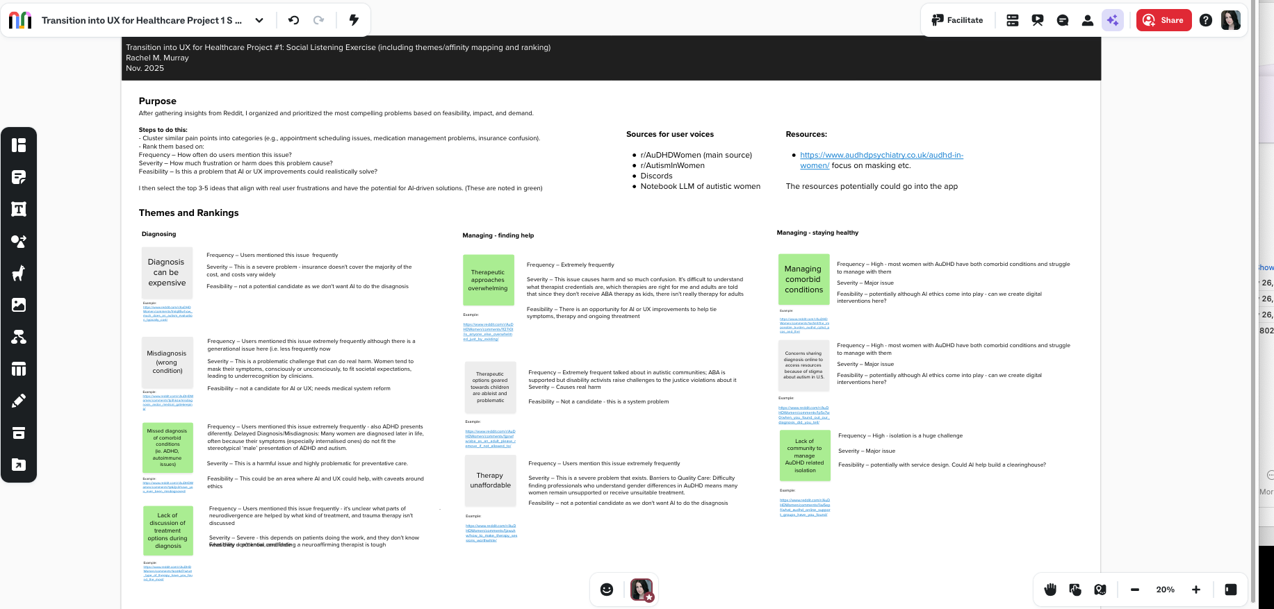
I did a social listening exercise to understand the challenges. I took some of the most common issues from Discords and the most common sub Reddit for AuDHD women (https://www.reddit.com/r/AuDHDWomen/) and added them to a Mural, and then categorized them into diagnosis or managing conditions (e.g., appointment scheduling issues, medication management problems, insurance confusion)
I then ranked them tied to three facets of feasibility, frequency and severity.
- Frequency – How often do users mention this issue?
- Severity – How much frustration or harm does this problem cause?
- Feasibility – Is this a problem that AI or UX improvements could realistically solve?
I then select the top 3-5 ideas that align with real user frustrations and have the potential for AI-driven solutions. Therapy came out a clear area to explore.
- Frequency – Mentioned extremely frequently on the most popular AuDHD women’s subreddit.
- Severity – This issue causes harm and so much confusion. It’s difficult to understand what therapist credentials are, which therapies are right for me and adults are told that since they don’t receive ABA therapy as kids, there is no help for them that’s effective.
- Feasibility – There is an opportunity for AI or UX improvements to help tie symptoms, therapy and ongoing treatment.
The challenge is that every AuDHD woman has unique challenges – how the two conditions impact her can vary widely, and we need personalized solutions as a result.
Understanding therapeutic options for AuDHD women can be overwhelming.
How might we create a way for women to learn about symptoms, their causes, and possible therapeutic options so that they gain knowledge and empowerment in possible treatment options?
Competitive analysis
I deliberately stayed away from a lot of market research because of the timing of the course and instead spent a lot of time diving into the ‘source material’ from places like the Mayo Clinic. I would go onto find at least 16 sources online discussing treatment, prioritizing from medical establishments for this version.
Hypotheses for the MVP
I also thought of a few hypotheses I wanted to explore:
- UI design – and features: I knew Lovable could help with the basic UI designs because I worked in before, but I also hypothesized it would identify the right features for that MVP.
- Backend: Lovable will be able to handle enough of the backend work that a developer would typically do, such as security, or point me to resources to address these areas.
- Roadmap: What is good for a MVP can be a mix of features, content and incorporating feedback; I hypothesized that while the course asked us to incorporate usability feedback, a lot of my time will be on improving the content and design rather than features.
Goals and design principles
Some of the goals included:
- Neuroaffiming: Build something that responses the community I’m designing for
- Simple: Therapy has a lot of variable to consider, but we’re not building the Wikipedia of therapy. Focusing on a simple design and set of features ensures that I’m able to learn Lovable, build a product that isn’t overwhelming and also practice the idea of scoping out a MVP in the time alloted
- Enjoyable: This app isn’t just about the search results at the end, but hopefully serves to inform users about things they don’t know – and is enjoyable while doing so.
The process
Project Management
As with any project, it starts with the basics of project management – staying organized is a key to being able to build quickly and carefully.
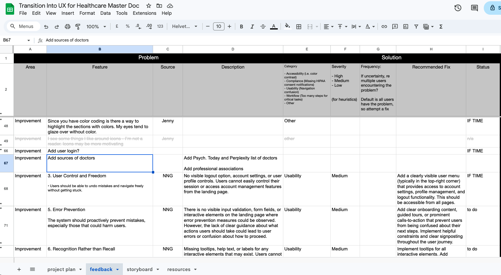
I set up my Parking Lot Google Sheet with tabs I, as a product designer, product manager, and project manager, would need:
- Project plan: the solution to so much of our work lies in staying aware of what’s done and what’s next
- Feedback (pictured above): easy to track when it’s in one place
- Storyboard: the essential to any video
- Resources: the list of sites discussing therapy
The Prompt
I created a simple PRD and entered it into Prompt Cowboy (with an assist via ChatGPT) to create the basics for the main prompt:
The product and solution space
Neurasana is a digital toolkit that empowers neurodivergent women to participate in their care with confidence by providing clarity on the relationship between symptoms, therapeutic options and ongoing chronic care management. Neurosana is a plan for AuDHD women’s wellness. These tools don’t diagnose or prescribe. They translate, structure, and empower — filling a knowledge gap neurodivergent women say exists.
I created a simple PRD using the same template I used from Civic Hall Labs, and focused on basic user stories for MVP. I then assessed what was in and out of scope during the Product Roadmap portion. I didn’t add much detail for Acceptance Criteria so that I could focus on quickly building out a prototype rather than finishing a production-ready application. I used the product roadmap spreadsheet template I created during a previous project to stay organized and kept this rather than move to Trello or Jira because of the class schedule.
Features
MVP
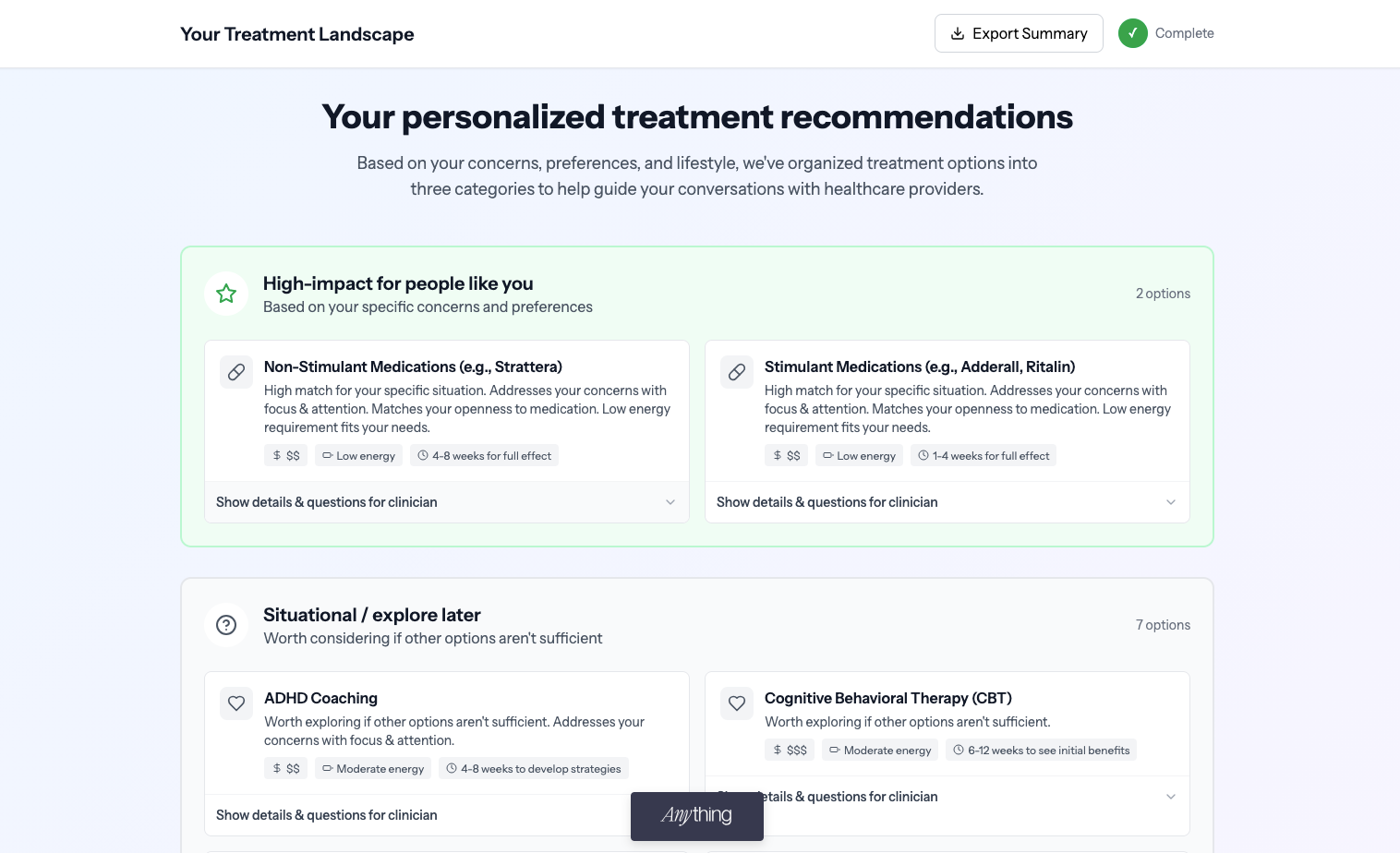
- Personalized Treatment Explorer that maps out evidence-informed options based on common challenges and preferences. Perplexity provided symptoms and major modalities (therapies) for ADHD + autism therapy from 20 sources like the Mayo Clinic. The app is a ‘Intelligent Rules Engine’ that categorizes treatments into three tiers based on user inputs: Tier 1 – “High-impact for people like you”, Tier 2 – “Helpful but optional” and Tier 3 – “Explore later”.
- Side-by-Side Treatment Comparer that lets users instantly understand the difference between two treatments
- Appointment Prep Coach that generates a clinician-ready agenda with common questions to ask when speaking with a clinician
Post MVP
- Accessibility: there are a lot of suggestions from the usability heuristic evaluation to incorporate, including “implement keyboard shortcuts for common actions”
- Account: add ability to have account so users can save favorite therapies and clincians, delete their data etc. implement single sign on, share results
- Business model: think about pricing – partner with different pharma companies, psychology today, providers etc.
- Community: add community discussion forums and incorporate the user feedback
- Content: add terms of service, improved PDF design
- Glossary: add glossary with common terms
- Medication: a user selected “no medication” options but they showed up, so this may be a bug
- Providers: add providers listed and track progress of which clinicians you’ve contacted
- Resources: add community resources
- Source: add source of recommendation beside it (similar to how Perplexity does it) from existing source list
Design
- Design via prompt engineering
- I had chosen Lovable because of discussions in my GenAI learning circle, and I felt it was a solid choice to learn, as it appears to be one of the market leaders in this space (according to this video and others doing a market scan). I also didn’t want to design first in Figma and import into Lovable, as I tried to approximate how product managers might use the software as well. I also wanted to understand what kind of design patterns were built into Lovable rather than relying on a reference picture or an import from Figma.
- Branding:
- Logo: I was surprised that within an hour of using Canva I had a decent first attempt at a logo:
- Naming: I explored using a variety of AI tools, but found that ChatGPT’s suggestion of Neurasana – Latin for ‘healthy nervous system’ felt direct, positive, and beautifully aligned with brain-health empowerment.
- Visual design: I selected visual assets like illustrations, and was surprised how well Lovable out of the box generated a simple but evocative design system focusing on a reskinned version of Material Design:
- Soft sage green primary (calming, medical-adjacent)
- Warm coral accents (inviting, energizing)
- Cream backgrounds (easier on eyes)
- Generous spacing (reduced cognitive load)
- Clear semantic tokens for treatment tiers
- Smooth, subtle animations
- I was curious how Figma Make, Create.xyz and Lovable would all handle the same prompt, and was surprised at what I found. test
- Figma’s output felt underwhelming. Create.xyz had a good prototype but the preview wasn’t working, which made revisions a challenge with no dev server and code interface
Lovable turned out to be a solid bet – let’s see how it generated the work:
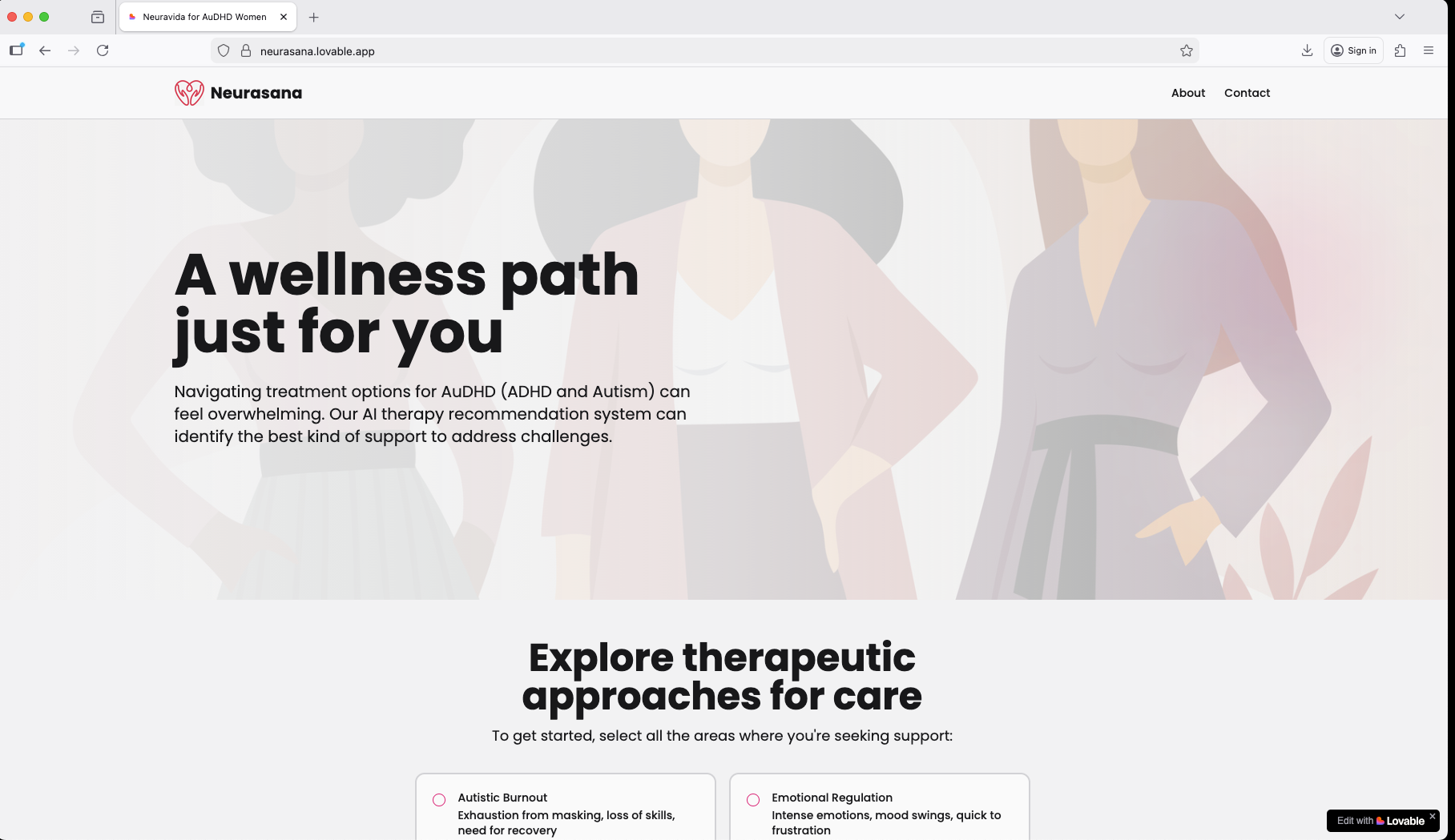
Home page
I felt like the branding was approachable, modern, positive and affirming and it felt really lovely to work in the branding space as part of this project.
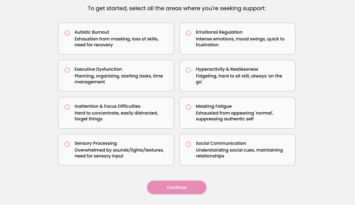
Symptom selector
I explored how to create a visually interesting way to explore the categories. There were a few pages here and I wanted to ensure the flow of screens never felt overwhelming
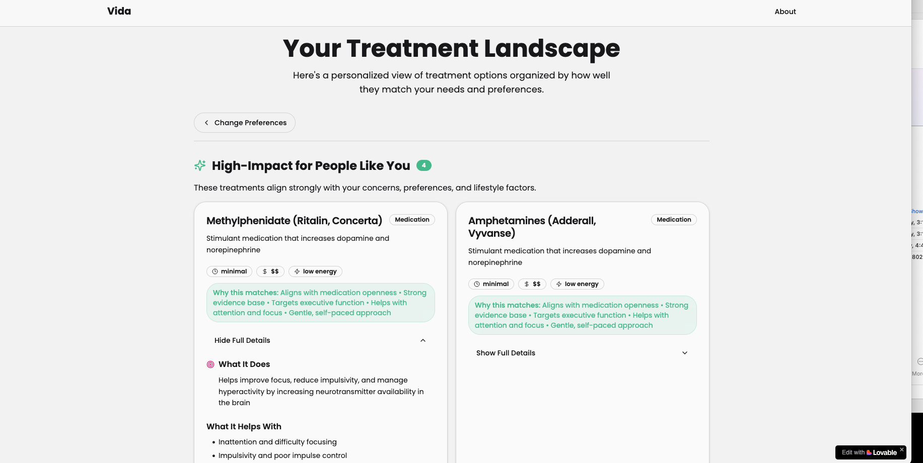
Search results
I spent a lot of time looking through the results to ensure the content was useful to those who may not have as much familiarity with therapy
Search results – detail view
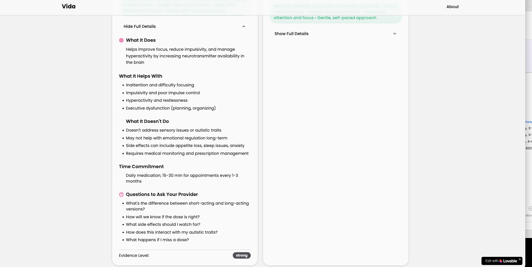
I chose the variables about what a therapy does, how it helps, what it doesn’t help with, time commitment and other key areas that would be helpful to practitioners.
Design Decisions
Design decisions and assumptions made include:
- ‘Matching’: The heart of the app is matching symptoms to possible therapies, the assumption being that matching is more valuable than being a simple list of therapies
- Content: Using the list of content identified from Perplexity
- Web vs. mobile: Prioritize Web for first release although it is responsive and viewable on mobile
- Product roadmap: Focus on small set of features for first draft, and additional ideas into for roadmap
- Branding: Minimal branding for version 1
I also was curious of Perplexity’s view of this product, so I entered my mini-PRD to get feedback around gaps. This is what I found:
- “The clear gaps in the provided content relate mainly to aspects of ongoing support, integration, and user engagement beyond initial treatment exploration and comparison:
- No mention of tracking or monitoring progress over time with chosen treatments to adjust plans as needed.
- Lack of guidance on how to integrate multiple treatments holistically or manage complex cases with overlapping needs.
- Missing features to connect users to community, peer support, or professional help beyond static content.
- No personalization around barriers or challenges experienced during treatment (e.g., access issues, side effects).
- Absence of educational content or coaching to build users’ self-management skills alongside treatment decisions.
- No support for users uncertain about diagnosis or considering new assessments (mostly on post-diagnosis).
Usability Testing
My goal was to validate demand for the product and to capture feedback. I created an interview guide for the following:
- Tasks: Scenario: You are a woman who identifies as having ADHD and autism. You are looking to understand therapy options.
- Task 1: Interact with the app
- Task 2: Submit the form and view results
- Task 3: View PDF
- Questions: Provide thoughts on:
- Where they currently find out about therapeutic options
- Copy (words on the page) – is the language easy to understand? Was everything familiar?
- Visual design (colors, images etc.) – is the visual engaging? Is there clutter
- Interaction design/usability – are you able to complete tasks?
- Is this application something you’d tell a friend or a neurodivergent person in your life?
- This application uses AI to create the recommendations. Would you need to know anything more about how the application works to trust the application or results?
- Would you create an account to save the results and send them to a someone?
- If I gave you a magic wand, what would you like this application to do for you? Is there anything missing that would be crucial?
I tested the product with three women with ADHD and/or autism and/or AuDHD and typed their feedback into an Google sheet which was the impact versus effort matrix.
Metrics
- Clinical impact: I did not test with clinicians since they are not the target audience, and instead focused strictly on patients in terms of metrics.
- Task success: Users who tested the app were able to successfully complete the form and view the results, including on the PDF.
- User satisfaction: Users mentioned that they felt confident using it and would recommend it to another neurodivergent friend, and that this felt as informative as their own research using Google search results.
Eventually as the app has more complexity – user profile management, lists of physicians, community forms, support pages – I could incorporate the System Usability Scale as metrics to ensure that the workflows can be completed. I also didn’t want to set time on task as a metric of ‘how long identifying the right therapy took’, as with a complex chronic condition each person’s individual symptoms would change the amount of time to evaluate therapies.
The main changes I made included the following:
- Accessibility: Challenges with font color, so I improved it by using black, resulting in improved accessibility
- AI: It wasn’t clear this was AI driven, so I added copy on the home page, resulting in clarity
- Alphabetization: Results weren’t in alphabetized order, so I alphabetized them, resulting in clarity
- AuDHD: Not everyone understood what AuDHD meant, so I added a definition, resulting in clarity
- Call to action: The ‘get started’ button seemed confusing with a form below it, so I removed it, resulting in clarity
- Language: The Lovable draft had some vague language (“Situational/explore later”), so I simplified the language, resulting in improved clarity
- Logo: There was no unique visual logo, so I added one, resulting in improved brand
- Pricing: Removed dollar sign since it wasn’t clear on how it was determined, resulting in clarity
- Tab: The browser tab had the previous name for the product (‘Vida’) so I updated it, resulting in consistent branding
I incorporated the feedback from the first group of users and validated with additional testers by asking targeted questions around the feedback (“Is the language clear, is explaining what AUDHD is necessary”). The largest change I made was to add a list of common organizations to find clinicians – so for Occupational Therapy (for example), a link to the American Occupational Therapy Association.
As I add additional features for profiles, tutorials and other more complicated workflows I would conduct additional usability testing to keep the application as usable as possible.
Prioritization
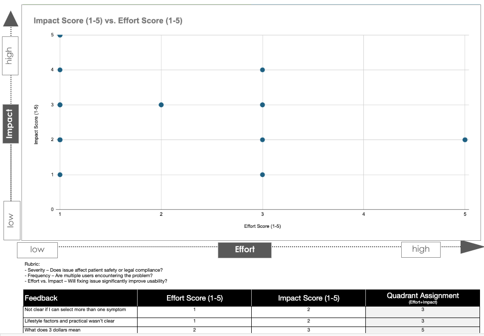
I prioritized feedback to incorporate into the product by using the Impact Effort Matrix framework. I also performed an accessibility check via WAVE and used Perplexity and my own skills to perform the NNG heuristic evaluation as additional feedback to incorporate. Interesting, a majority of the feedback also involved changes around copy, an area I feel that LLMs miss, although I didn’t specifically address that in the Product Requirements Document.
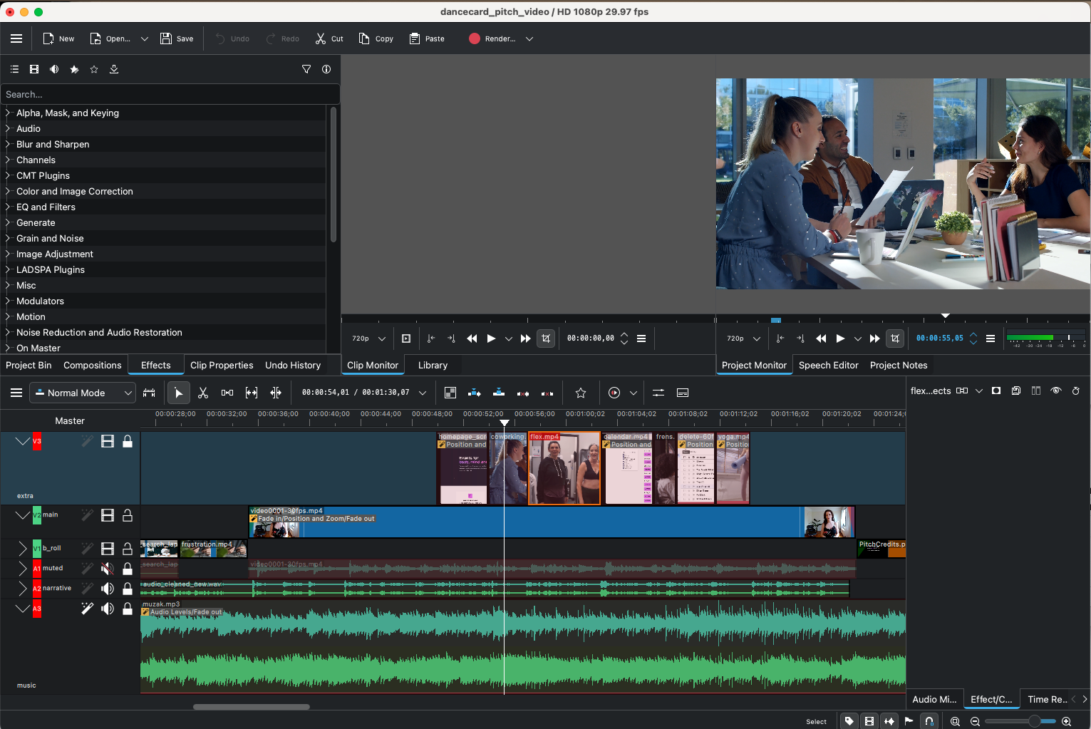
Demo presentation and pitch video
I created both a final presentation and a pitch video. This included writing a pitch script, recording it, sourcing b-roll footage and music, editing the video using KDenLive (an open-source film editor similar to Premiere), and I absolutely loved video editing and look
Results
I now have a MVP that can be launched to validate if there’s a market need.
Reflection
Creating this application helped me do more than use AI – it helped me rethink how to build and understand the impact vs. effort of what we build. I hope to finish a bit more of the application and add it to my portfolio – and hopefully build it out as a resource to help AuDHD women find the resources they need to thrive.
I like
- That I worked in a space for a community I love – women and in particular neurodivergent women
- That I was able to think through the complexities around healthcare and when an AI-driven app provides too much support
- That I was able to work in the ‘product manager, designer, builder’ space from start to finish and incorporate video as well.
I wish
- That I had tried other software
- I loved using Lovable but also am curious how the product might have changed if I had incorporated Claude – something to explore in the future
- That I had more time!
- So many times I wish I could just stop time and get another 3 weeks instead.
I wonder
- How to evolve this for the future
- There’s a lot more to say about this product’s evolution I’m hoping to share soon.
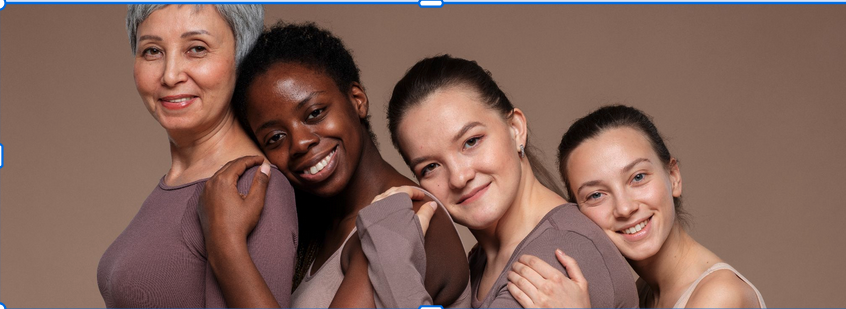
Photo of crowd courtesy Freepik
I got diagnosed in January 2020, and with therapy and a career I now live independently again. I actually feel some semblance of control over my own life now, which is a first.
– thelesserbabka_ via Reddit