
How might we help technologists understand emerging technology using design?
Helping PwC partners stay competitive using a social listening tool
- Role: Business analyst, graphic designer, interaction designer, web developer
- Software: Balsalmiq Mocksup, GitHub, Illustrator, Photoshop, additional Web development tools
- Team: myself and a junior dev, senior dev and team leadership

Situation
We live with more information than ever, but finding authoritative sources is becoming difficult, especially with emerging technology. With more content distribution networks focusing on more noise and less ‘signal’, can predictive technology help decision makers make sense of and take action in emerging technology?
Analysis
I created user stories as a result of research to make meaning from 200 feeds and make meaning from the chatter. We had two key user groups – users and stakeholders. For users – partners at PwC – the main goal was to help them identify and understand emerging technologies and their potential to be successful. For the stakeholders at PwC who sponsored the Emerging Tech Lab, they wanted to understand:
- Building: How to build a custom application for data visualization in-house – what skills, technology, and process would work to scale out future Emerging Technology projects
- Evaluation: Evaluate if the proof of concept should become a product – what it would take to scale it out both from a content perspective and a technological scaling perspective and to understand what it was like to work with the technical choices we made
- Education: Understand how to integrate design into the Agile development workflow and where Lean research could help us create something and launch it quickly for feedback
The solution
I created analysis, wireframes, branding and code for the project, working to build a Ruby based application that leveraged Natural Language Processing and D3 to build out the visualization portion.
Results

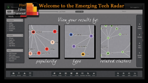
This mockup visualizes what the Radar would look like using a design framework like Material Design, which would have addressed some of the challenges in determining the direction for the UI. Much of the design direction you see here was by request of the stakeholders, and branding was deprioritized because of technical challenges with Neo4J, which made visualization difficult. Our client had an innovative product that demonstrated the Emerging Tech group’s advanced technological skills, and the team was able to use this product as a marketing tool showcased on the PwC Web site.
In Detail
Situation
With massive data and analysis, it’s easy to get overwhelmed by emerging technologies. Why do we talk about what we talk about in the news? How do we stay current on innovation? Can we identify viable emerging technologies before they become popular by analyzing blogs? We live with more information than ever, but finding authoritative sources is becoming difficult, especially with emerging technology. With more content distribution networks focusing on more noise and less ‘signal,’ can predictive technology help decision-makers make sense of and take action on emerging technology?
Analysis
Background
I applied to work at the Emerging Tech Lab within PwC and was excited to be accepted. When I joined the team, the product owner had previously conducted interviews, and the team identified and had written user stories for much of the backlog. The CTO for New Tech Ventures (our primary stakeholder) shared his experience as a partner (our end user), and we ran our work by him at a weekly cadence during the four months.
Goals
The client wanted to create a Web application to identify emerging technologies before they became mainstream by analyzing the content in tech and innovation blogs/RSS feeds. The question was, how would we visualize 200 feeds and make meaning from the chatter.
We had two key user groups – users and stakeholders. For users – partners at PwC – the main goal was to help them identify and understand emerging technologies and their potential to be successful. For the stakeholders at PwC who sponsored the Emerging Tech Lab, they wanted to understand:
- Building: How to build a custom application for data visualization in-house – what skills, technology, and process would work to scale out future Emerging Technology projects
- Evaluation: Evaluate if the proof of concept should become a product – what it would take to scale it out both from a content perspective and a technological scaling perspective and to understand what it was like to work with the technical choices we made
- Education: Understand how to integrate design into the Agile development workflow and where Lean research could help us create something and launch it quickly for feedback
Process
I tailor my approach and tools to meet the needs of my clients. Increasingly, prototyping plays a more significant role in what I do, using it early on to help create and validate an appropriate solution. This project operated using a Lean structure to create a minimum viable product. This process included the following stages, which we’ll get into:
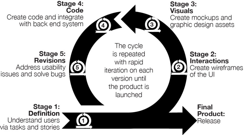
Stage 1: Definition – Understanding users
This phase focused on understanding our users and their pains and gains (opportunities to harness):
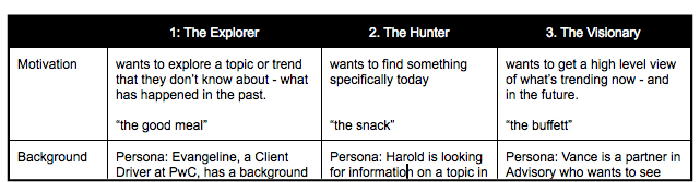
Personas
I created high-level archetypes of users and focused on creating user stories for this release. Because this was a highly technical MVP, we wanted to build something quickly to get feedback.
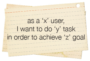
User Stories
I wrote and entered stories into Pivotal Tracker to track features and bugs, created a taxonomy to keep us aligned, and tagged over 420 of them, resulting in no bugs when we launched.
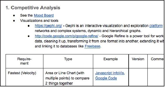
Documentation
I updated our system architecture diagram and created a competitive analysis of JavaScript visualization libraries for the lab to use in the future.
Tech Stack
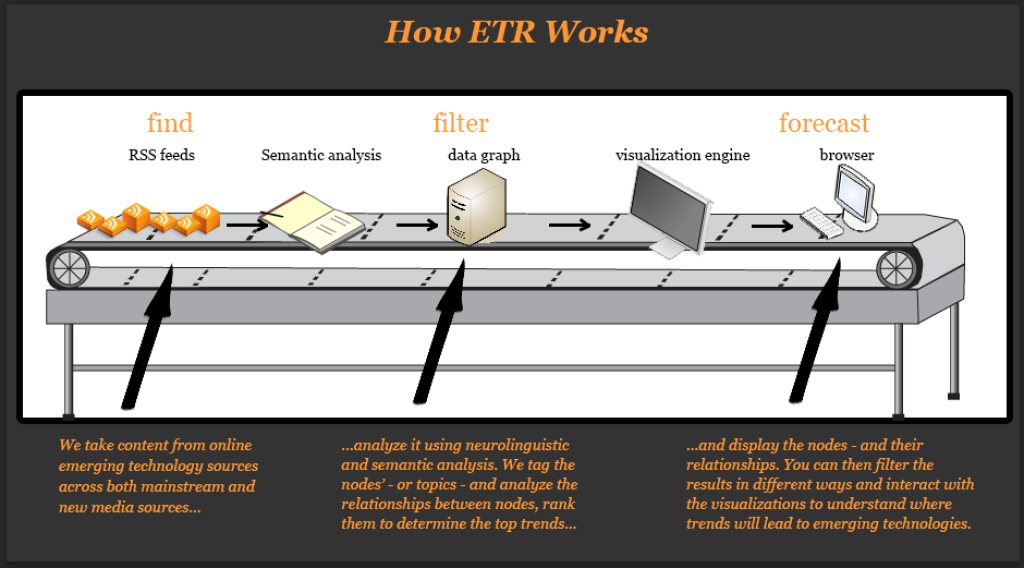
To better understand the Emerging Tech Radar let’s dive under the hood of the content visualization part.
Finding authoritative sources is difficult as content distribution networks increase the ‘noise’ vs. the ‘signal.’ A social media aggregator is one way to manage multiple sources. Additionally, dashboards often don’t provide recommended actions, but a radar can.
I joined a team of developers in progress working on a HTML5 based Web application. The project involved tagging content from 200 RSS feeds using automated tagging tools (Alchemy and Open Calais) to analyze the feeds (using semantic analysis). We then used Neo4J, a data graph visualization engine, to display the topics – or ‘nodes’. rent a car The relationships between nodes were displayed, ranked to identify top trends and visualized (via treemaps etc.) to display the quantified data using Ruby on Rails and Twitter Bootstrap as the interface. My role was to design the UI and advocate for users, especially important when designing a highly technical application.
I created several images to explain how the technology worked for the client to understand better what we were building and for end users of the application. Since we were processing and making meaning from information, I used the conveyor belt metaphor to illustrate the act of processing and how we returned our results.
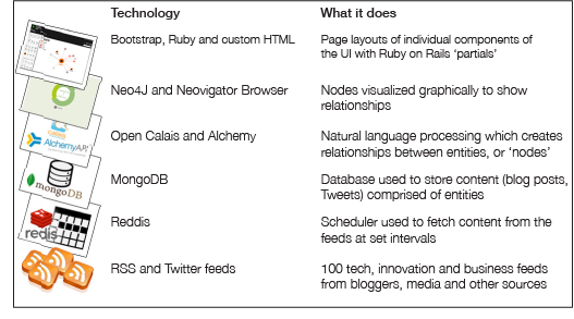
I created a diagram for more advanced users to explain the software stack and how we utilized it.
Stage 2: Interactions – Create wireframes
Context of design choices
- Interaction design: I worked without a design library because this was a proof of concept, and the focus was on building a light version of a highly technical product and understanding views and core interaction design (how people would interact with content).
- Visual design: I created various visual design approaches primarily driven by the choices of our key stakeholders. I worked with the existing PwC Brand guidelines primarily around color usage and typography, as a more formal branding guideline for Web applications did not exist.
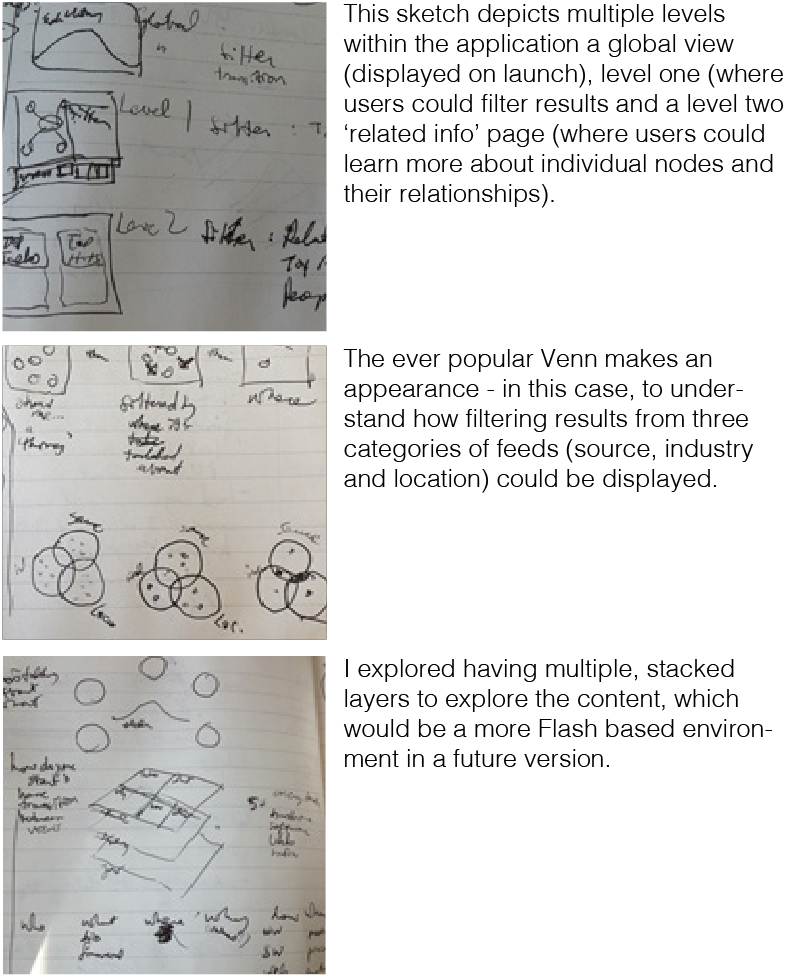
Sketches
I created sketches throughout the project to a) explore concepts for understanding our product vision and b) translate those concepts into the UI by designing wireframes. Sketches depicted how our end user’s interface would display the data – and how we on the ‘other end’ needed to structure our technology to display that data.
Wireframes
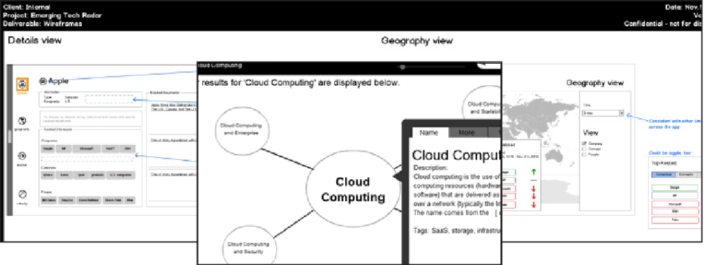
After sketching my concepts, I worked in Balsalmiq Mocksup to create medium fidelity wireframes to gain consensus from the client, clarify some of our design decisions, and explore future directions. I created high-fidelity wireframes but tended to use medium fidelity in areas where we agreed to move to code as soon as possible. Wireframing involves understanding how users will interact with a site – which provides clarity around the functionality of a system- but also how to humanize that experience.
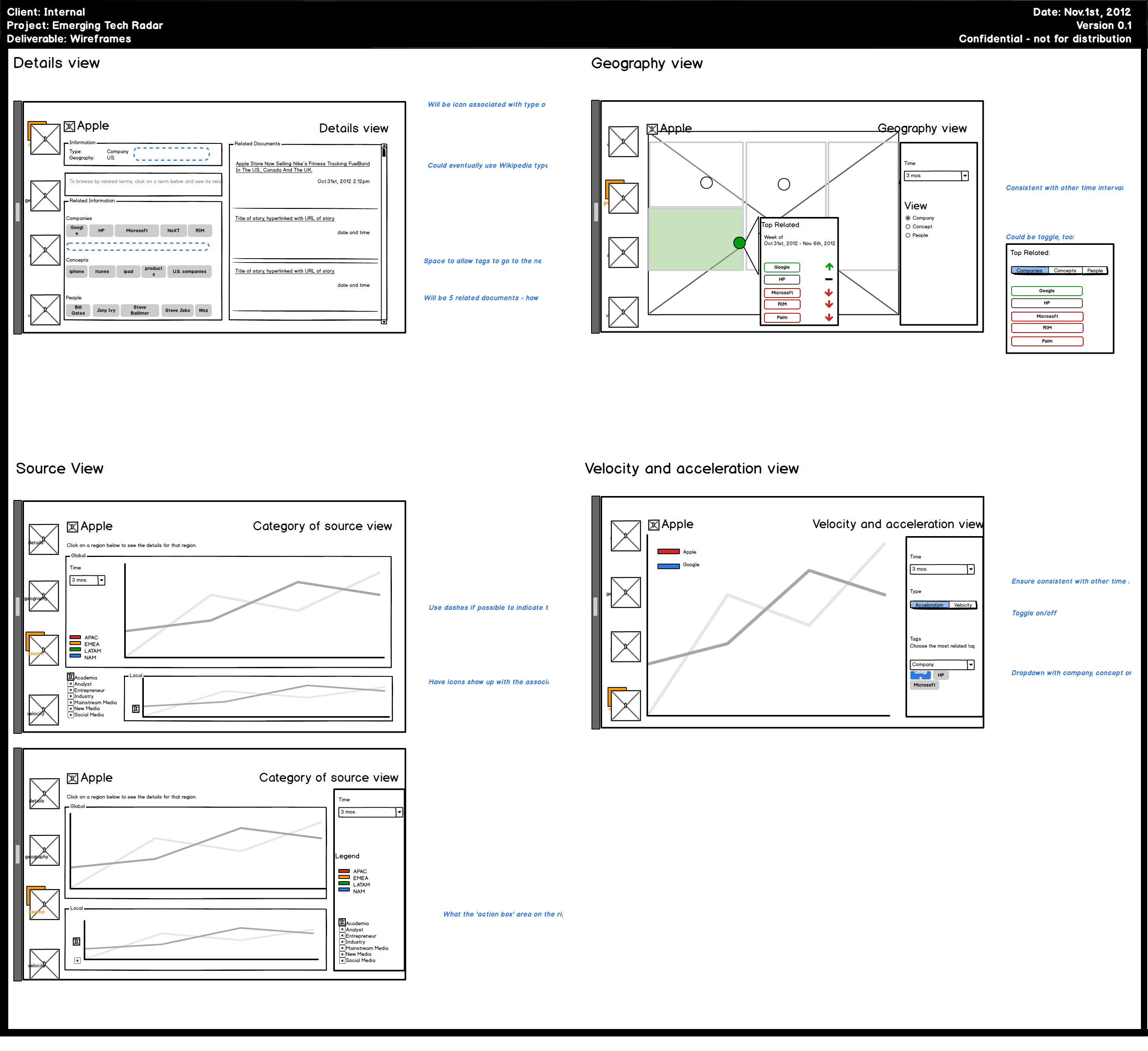
Views
I created a variety of views after identifying how people would want to interact with results – over time, geography, source, etc. and how to display secondary information that would be useful for context.
Key Question: Micro questions to answer when designing an interface
As a user experience designer, you are faced with many micro questions that govern choices about size, functionality, placement, and more. For example, for our instructional tutorial, which would be better – Bootstrap’s Javascript-based module window (which greys out the background but was limited to one image), and where does it make sense to use the built-in Carousel Javascript as an image gallery? Rather than explain the entire application in one overwhelming image, I designed a short tutorial and placed it in the Carousel to give users a guided tour of the features. You can view a picture of the tutorial on page 22. I decided on appropriate sizes for each element – the pagination for results could be small, medium, and large. When I settled on the proper size, I noted the accompanying class (“.pagination-large”) directly in the wireframe to speed up development.
Stage 3: Branding – mockups and graphic design assets
Tutorial
I created a multiple-image tutorial explaining the application’s key features and how our technology benefited the user – in the image below, filtering and viewing search results via popularity, type, and relationships. I worked with the existing PwC brand colors to ensure the application was consistent with our brand while remaining visually attractive to the end user.
Icons
I selected icons from Open Source SVG icon sets (Font Awesome – integrated natively with Bootstrap – and IcoMoon) and in some cases created my own icons in Illustrator for concepts not already in Font Awesome.
Key Finding: Icon sets are fantastic – but buyer beware
A pain of Web development has always been image slicing. SVG-based icons help end that pain since SVG is a Web-based font that renders an image in the browser. Using multiple SVG icon sets can be a problem since they might have the same name for icons. I addressed this by having unique names for similar-looking icons (‘fa_lightbulb’ to reflect it’s from Font Awesome, rather than a generic ‘lightbulb’) to ensure that the right Twitter bird showed up no matter which icon set we used.
Stage 4: Code – Create code and integrate with backend
This stage was the culmination of all our hard work to date – and involved bringing the application to life in code and attaching it to our powerful backend infrastructure.
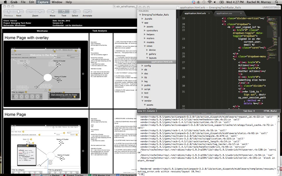
I was able to contribute actual code, and worked in Sublime (seen in the black screen) to build some of the screens in our UI, and in particular the areas like the filter drawers which had icons and the instructional tutorial modal image. I would have a local copy of our application running, make my code changes in Sublime, and push my changes to our development server using GitHub. It was profoundly exciting to work in both design and development; I had build my own Web sites in HTML and CSS but this was another level of joy.
Key Finding: Never too early to understand developer’s pain points
We know to think about pain points for users, but it’s also good to think ahead about potential pain points of teams when building. What visualizations we choose (barchart, treemap etc.) affects what technologies we’ll use – in this case, which Javascript library to use. We ended up choosing D3 over a massive system like Dojo because of good documentation, release notes, and visuals, which help ensure less stress when building.
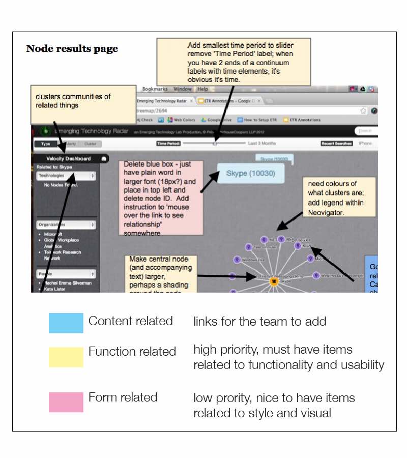
Usability heuristic evaluation
I performed ongoing usability heuristic evaluation of the prototype, iterating on each version during sprints to improve the application’s usability and visual styling. I divided these into three categories – content, function, and form. The evaluation helped the key stakeholders understand the time required for product improvements as the product evolved.
Key Finding: Test, test and test until you can test no more
Good developers know to write tests to ensure they see the success criteria for that code to work. I didn’t have the opportunity to develop unit tests, but I ensured that the code I created in the front end worked by working with another developer to test our work often in multiple browsers – and by doing light pair programming to build the designs together. I also actively tested my designs with people unfamiliar with the project as a form of guerilla usability testing to ensure that what I designed and coded was always human-centered rather than code-centered.
The solution and product
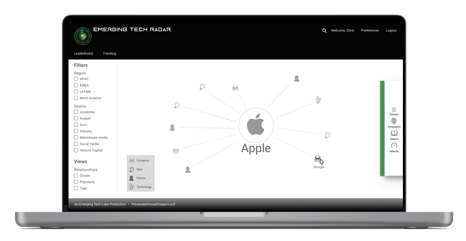
This mockup visualizes what the Radar would look like using a design framework like Material Design, which would have addressed some of the challenges in determining the direction for the UI. Much of the design direction you see here was by request of the stakeholders, and branding was deprioritized because of technical challenges with Neo4J, which made visualization difficult. I occasionally created mockups in Photoshop to help align on creative direction.
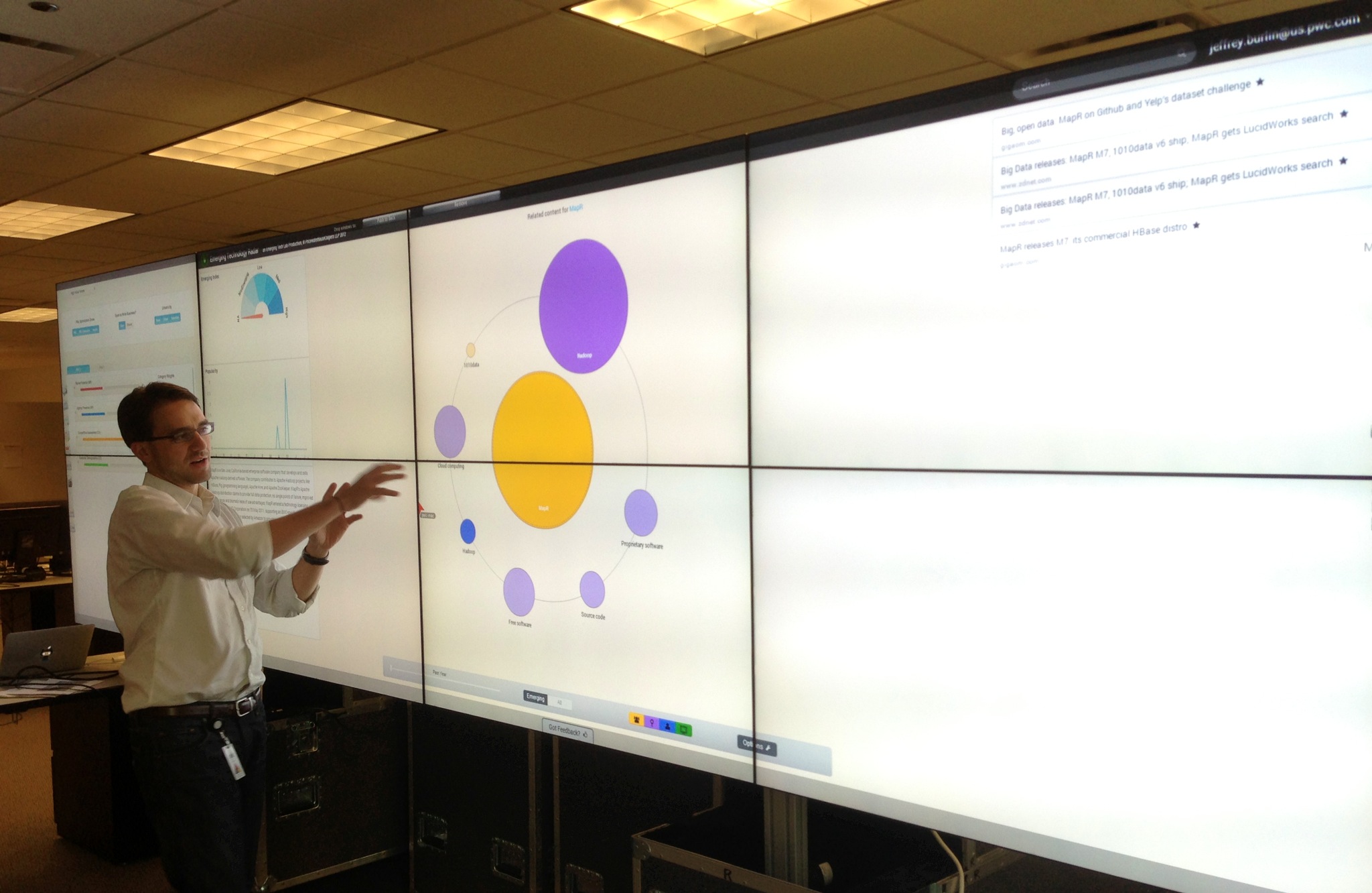
This photo shows one of our team members, Jeff, explaining how the nodes in the Radar worked. The final design we ended up with, you see here, was shaped by our constraints in development time, struggling to get the nodes to display rather than the visual styling.
Key Finding: Document your lessons as you learn them
Companies understand the value of setting metrics at the beginning so that a team has agreed on goal(s) – to measure success. Something not emphasized as much is the value of documenting the lessons and design choices you’ve made during the project. As someone with a background in knowledge management, at the start of every project, I commit to documenting what I’ve learned – personally and formally in lessons learned or project post-mortem – as well as the design decisions. Decisions I would document in the future include:
- General decisions on collaboration: how teams can iteratively improve how they design, develop, and evolve to use the advanced features of collaborative software – for example, using Epic Stories in Pivotal Tracker to bundle stories to track their completion
- Content: what content is used, and for the written tone used, reasons why a particular tone was chosen
- Design: what influences shape the design and for each decision that is postponed or rejected, if that decision can be revisited to ensure the product evolves
- Features: for every feature, the team should ask itself what is the query to ‘find’ it, where that query is stored, which Javascript library to visualize the results of a search, where a feature will live in the UI, how the user will interact with that feature in a normal flow and exceptions to that normal flow, and how we confirm that our solution addresses user needs and pain points
- Technology: when we switch to a different Javascript library, database, or query language, why – is it a conflict with an existing library, issues of scalability, difficulty in implementing the library, etc. – and how can the problems we encounter be avoided
- Users: who are users are, how our original understanding of their needs and our solution evolved, and how we can develop the product to ensure we never lose sight of our user’s needs
Reflection
This was a highly technical and creative project that allowed me to explore a 0-1 MVP that was new ground for both myself and the company. Some reflections include:
I like
- I WAS A DEVELOPER: Many of my projects have involved me being a UXer while also doing product and project management, which I did on this project. However, this was the first time I sat down and developed and pushed code on an app, which was fascinating. I learned about Ruby and its power and saw the value of a framework that could make ‘installing Wikipedia’ via a command line easy to do. I was able to pair with a junior developer learning Cypher, and it was fascinating to switch between the design and implementation in the code parts. I hope not to do too much coding in the future, but I am thankful to have experienced this and have the safety to create a proof of concept for 4 months.
I wish
- The perennial wish: more research, please: I am likely always to say that phrase but recognize that we were fortunate to have an available end user to give us direction, but I wish there were more time for more formal research up front that I was involved in. We had a schedule and little room to deviate from building our MVP; in some cases, development time was devoted to just getting the data graph to display in the UI, and we were unable to take the time to properly research approaches (in Neo4J, in Cypher) to address the problems, understand user pain points or understand how the prototype could become a product and associated Go-to-Market needs.
I wonder
- How do you take a proof of concept and scale it out? We quickly found challenges with parts of our tech stack. We chose the right programs, but natural language processing via Open Calais and Alchemy struggled to create relationships between two entities or nodes. When we tried to visualize connections in Neo4J using Cypher, Neo4j’s graph query language, they often displayed them accurately. As a result, our development time was slowed to fix the Visualizing In Cypher headache rather than build out the UI. It also meant we couldn’t build out interesting filters such as geography, time, and source that would have made the product even more valuable. As a result, scaling out a go-to-market to add more feeds and UI design requires planning and a bigger team.
Result
Our client had an innovative product that demonstrated the Emerging Tech group’s advanced technological skills, and the team was able to use this product as a marketing tool showcased on the PwC Web site. The team contributed useful knowledge about a number of key technologies like visualization, and was able to contribute to the CTO’s thought leadership about emerging technology. The results translated into:
- Impact: The proof of concept enhanced the stakeholder’s ability to speak to challenges in creating natural language processes products, and how to scale a proof of concept to a full scale product
- Metrics: Increase knowledge about a proof of concept and accompanying technical topics like semantic analysis
Dashboards in banner courtesy Kevin Ku